Guest post by author Tony White, who writes about his new novel Shackleton’s Man Goes South, the Science Museum’s 2013 Atmosphere commission. Download the book here.
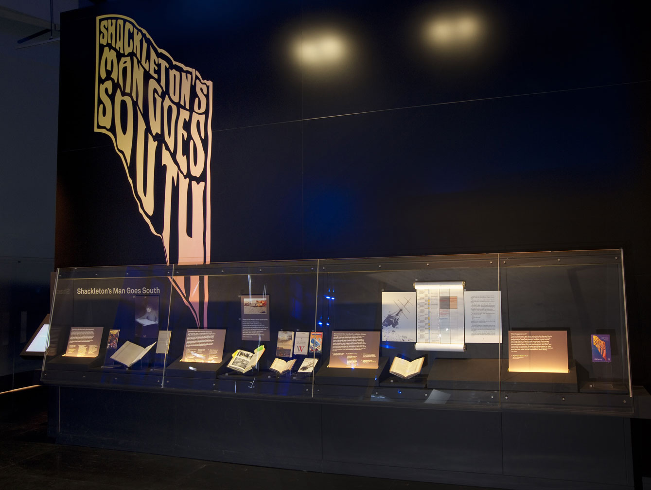
I’m really excited that the moment you turn the corner from the lifts on the 2nd floor of the Science Museum you get a clear view right across the Atmosphere Gallery to a large logo on the opposite wall, twenty-feet high, which seems to be melting or dripping down the wall but which still recognisably spells out the words ‘Shackleton’s Man Goes South’. This is the title of my novel which has just been published by the Science Museum, the first novel that the Museum have ever published!
Beneath this large wall graphic you will find a touch screen where you can email yourself a free ebook of Shackleton’s Man Goes South, and there is a special display showing some of the scientific and literary inspirations behind the novel. (Listen to an audio extract. Download the novel here until 24 July.)

The novel was inspired by two things: a science fiction short story warning of climate change that was written on Antarctica in 1911 by a polar explorer and atmospheric scientist called George Clarke Simpson, and secondly by silent black and white film of Antarctica, shot during Sir Ernest Shackleton’s heroic expedition of 1914-16; the first moving images of Antarctica that most people at the time had ever seen.

My novel fuses these ideas to tell a new story about Emily and her daughter Jenny, climate change refugees who are fleeing to Antarctica instead of from it as Shackleton had done, in a hot world rather than a cold one, but a world in which the Shackleton story has become a founding myth of the new continent, much as the story of Christopher Columbus gave symbolic value to historical migration to the United States of America.
I wanted to try and communicate some of these ideas in the Shackleton’s Man Goes South logo, so I approached leading British designer Jake Tilson, who is well known for his work with the likes of Ian Dury and the Blockheads and many others.

In our early conversations Jake and I both wanted to relate the logo to polar-themed books and films of the Shackleton era, so he created an Art Nouveau-style typeface and used this to spell out the title of the novel, before using computer software to ‘morph’ the lettering, as if it were melting and dripping down the page: ‘going south’ as the title suggests. Normally one associates the name of Shackleton with snow and ice, with cold colours such as pale blues or white, but we wanted to reflect the kind of colouring that is used on maps to communicate global temperature increases. Our logo is spelt out in bold yellow, and as it melts the logo changes subtly to a warmer orange.
Jake Tilson’s logo for Shackleton’s Man Goes South is a crucial part of the designs for both the novel and the Atmosphere Gallery display. It has been a huge privilege to work with a great British designer like Jake Tilson. I hope that his melting logo for Shackleton’s Man Goes South will intrigue Science Museum visitors, as well as giving some clues about my book and the story it contains.