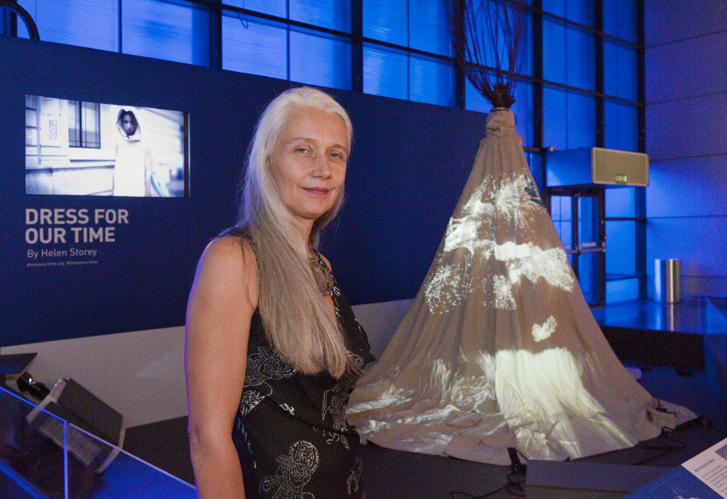
Karinna Nobbs is a Digital Storyteller at Holition, an award winning digital creative studio specialising in emerging technologies and 3D digital experiences. Here she explains their process of data visualisation and projection mapping for Dress For Our Time by London College of Fashion’s Professor Helen Storey MBE RDI.
Over the past twelve months, four of Holition’s team have worked tirelessly on Dress For Our Time: Tommy Howard (Head Creative), Noah Henderson (2D Artist), Miguel Ceballos (Creative Technologist) and Matt Nelson (Project Manager). Miguel was in charge of coding and programming the UN refugee data and worked closely with the rest of the team to conceptualise and shape the data visualisation based upon the geographical movement of the refugees, whilst Noah oversaw projection mapping of the data.
Both these tasks were hugely challenging – the team were using numbers to tell human stories and needed to create a map that nobody had seen before, that was both an abstract artistic piece and something that was logical enough for visitors to understand, all the while ensuring it was accurate and meaningful.
The data that Dress For Our Time is using was released in June this year by the United Nations High Commissioner for Refugees (UNHCR) Global Trends Report on Forced Displacement. The UNHCR currently recognises 16.1 million people as refugees worldwide. This project focuses on a portion of the globe which is currently home to 8.02 million refugees (49.8% of the global refugee population): Europe, North Africa and the Middle East.
The team settled on the idea of using a map as the underlying reference point for the visualisation as it is easily identifiable and effective at putting the scale and geographical spread of this crisis into context for the viewer.
A key visual concept for the piece is that one pixel represents the lives of one hundred refugees, meaning that there are 80,000 pixels of light in play on the Dress. The lights flow up from six points at the hem of the dress, which represent the continents the refugees have left, before populating the countries in which they find shelter.

At Holition we believe that art and science can and should co-create in order to provide new perspectives and this project really is a perfect example of this notion – Tommy Howard called it a “perfect canvas to express a global problem through the innovative alchemy of creative data visualisation and Helen’s skills as an artist and designer”.
Similarly, Jonathan Chippindale explained to me that the Dress For Our Time collaboration has very much been about humanising the data in the hope that the visitor empathises with it – “we wanted to focus on the individual, to encourage viewers to begin to see the scale of the refugee crisis not just at a geographical level, but also at a more human level. Hopefully, viewers will start to realise that, faced with the same set of circumstances, they too might have been forced to make the same decisions, and that in reality we are both no different”.
Dress For Our Time opened at the Science Museum on 17 August and will close on 4 September 2016. This project runs alongside Our Lives in Data, an exhibition investigating human stories behind data science and how big data is being used to rapidly transform the world around us.